Building a One of Kind
Virtual Tabletop
One More Multiverse (OMM) was a highly ambitious platform for telling cinematic stories with tabletop games. We created custom gameplay experiences for Dungeons & Dragons, Blades in the Dark, and Yazeba's Bed and Breakfast. As Design Lead and the sole UX designer I worked with product, a UI designer, and engineering to deliver flexible and powerful creative tools.
I went through to define and design MVP launch, delivering detailed designs and flows for every part of the experience. We had over 20K DAU, 400k created game worlds, 1.7k bundles of user generated content, and an active discord with over 40k members.
Design Lead
Product Strategy
Design Management
Stakeholder Brainstorms
Experience Design
Site Map
Wireframes
Visual Identity
User Flows
User Research and Analysis
Rebuilding Our Information Architecture
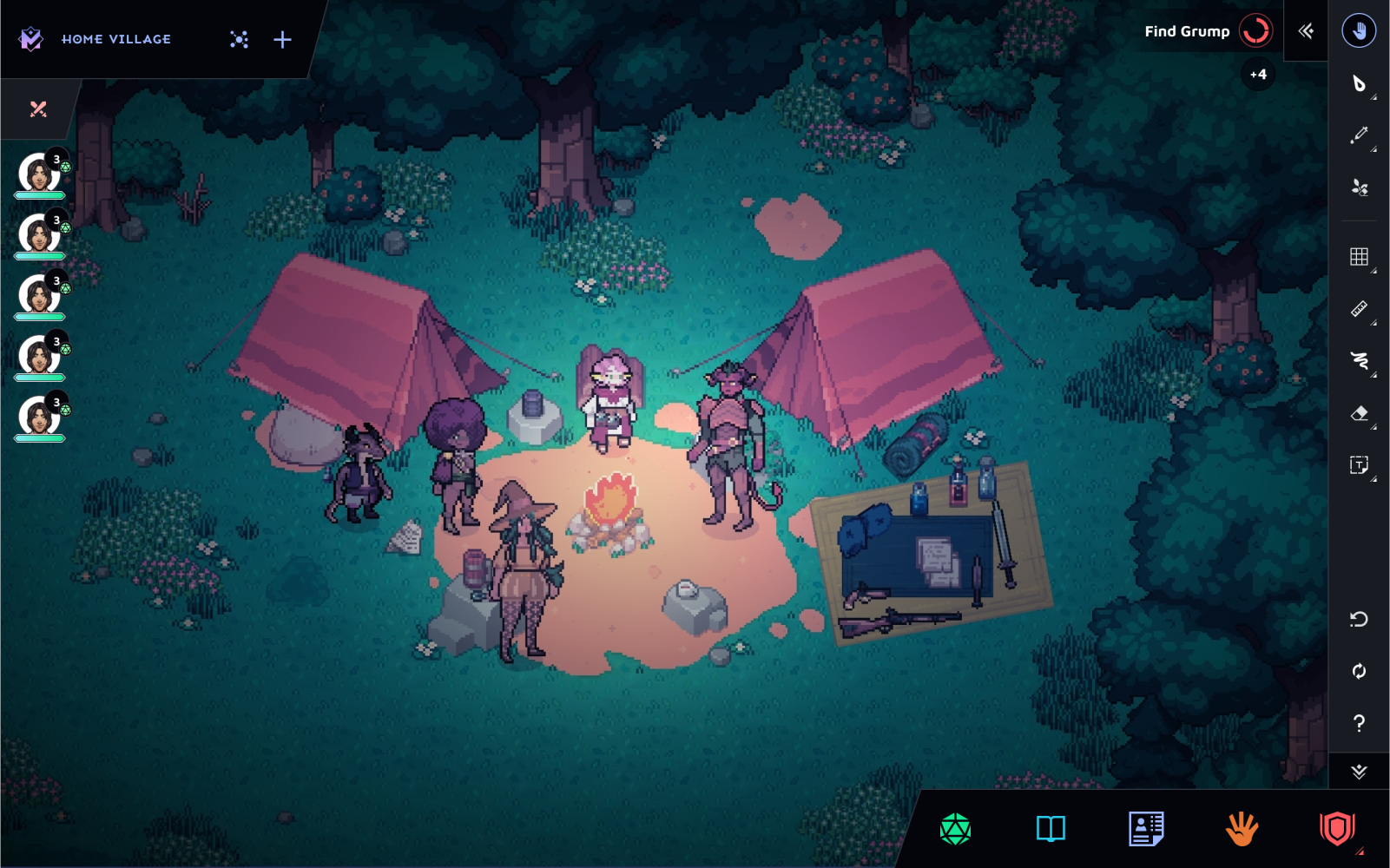
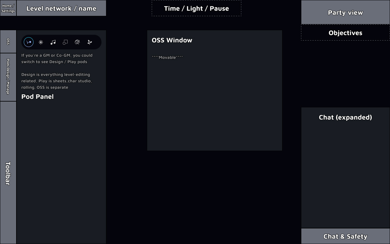
As OMM planned to launch the alpha product out of closed beta it became essential to reorganize the HUD on our virtual table top. Due to a long phase of engineering led development the platform was bloated with tools that were difficult to discover and use. New users often needed to attend our staff-led tutorial events in order to get started. We wanted to use the opportunity to cut some deprecated features while also organizing the HUD to be able to reasonably scaffold features in the future.
At the core of OMM’s experience is the mission to transform the way game masters and players could tell stories visually in the online space. Therefore the main challenge became how to balance clarity and flexibility with the array of creative tools that platform had to offer. We wanted to support all the creative needs of our storytellers while still making the tool accessible enough for new users to hop in and play. We also used the opportunity to genuinely assess legacy features and their viability with metrics and player usage.
Feature Audit and Card Sort
I created a feature map of all the features in the current HUD with their location on the screen, including modals and navigation items such as titles and submenus. Visualizing this map gave us a sense of the overwhelming amount of user choice presented when first opening the platform. I then began to categorize the features by their supposed use case, what level of the game that they modified, and when in the player journey these tools were expected to be used.
I took a semi-random sampling of 35 features to try and determine different types of categorization. In addition, I also observed a variety of expert and novice player try to achieve normal goals on the platform such as creating a new game (aka Verse), creating a character, rolling dice, and changing levels.
Feedback & Observations
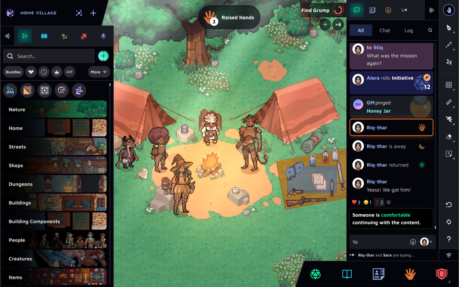
The HUD has no discernible logic regarding what lives there, and players just needed to memorize what they needed and where it lived. The tool bar mostly has to do with the Creation Pod, but also User Settings and some level visibility. Our “Pods” feature had a variety of uses of mixed uses. This, in addition to the menu bar only having abstract icons and text on hover, makes navigating the menu bar a high cognitive cost. UX Writing was also is also an issue. Some features like Character Sheet are very clear, but many features had ambiguous names and unintuitive behaviors.
Modifications
We decided to organize content on the HUD by the part of the game state that they modify. That way certain features that only the Game Master can use would all be visible only on certain parts of the user interface, and players with limited agency would have a more streamlined and less confusing experience.
We collected feedback from 15 players by demonstrating a low-fidelity prototype. We offered no direction during this stage to see how users interacted with the objects, and if they understood our system. We also asked interview questions after the experience and had many helpful conversations.
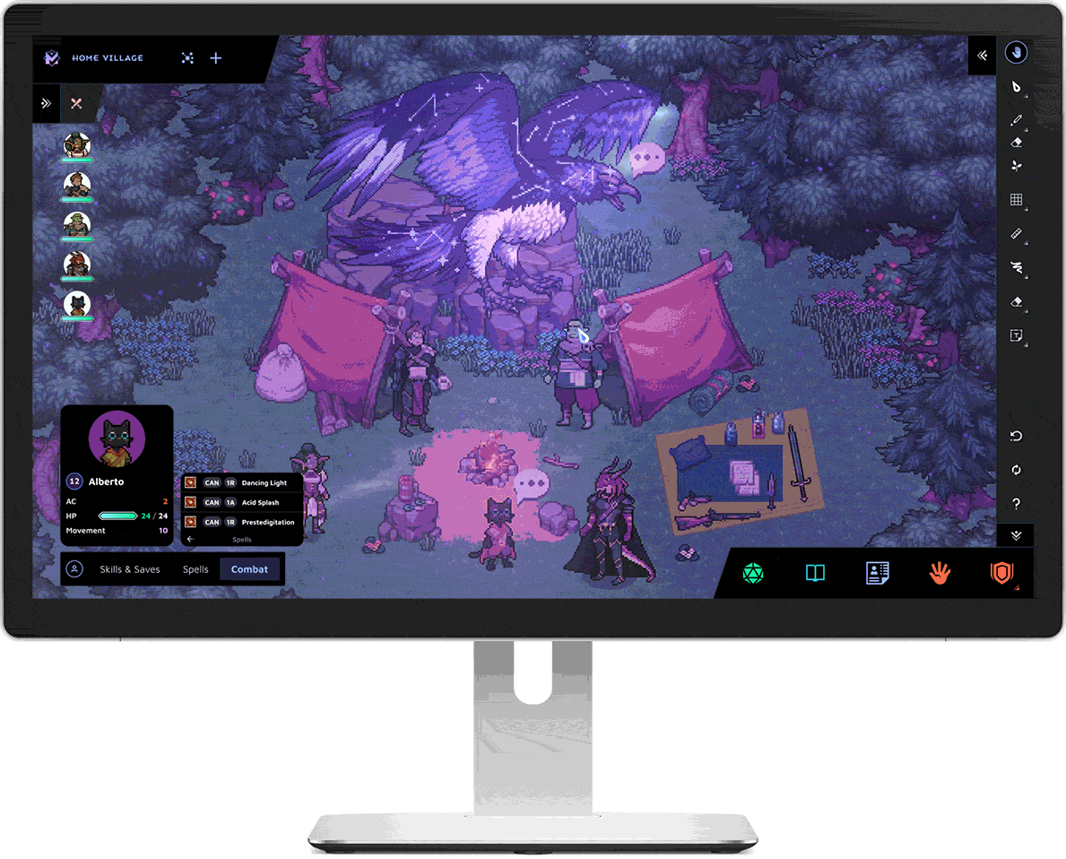
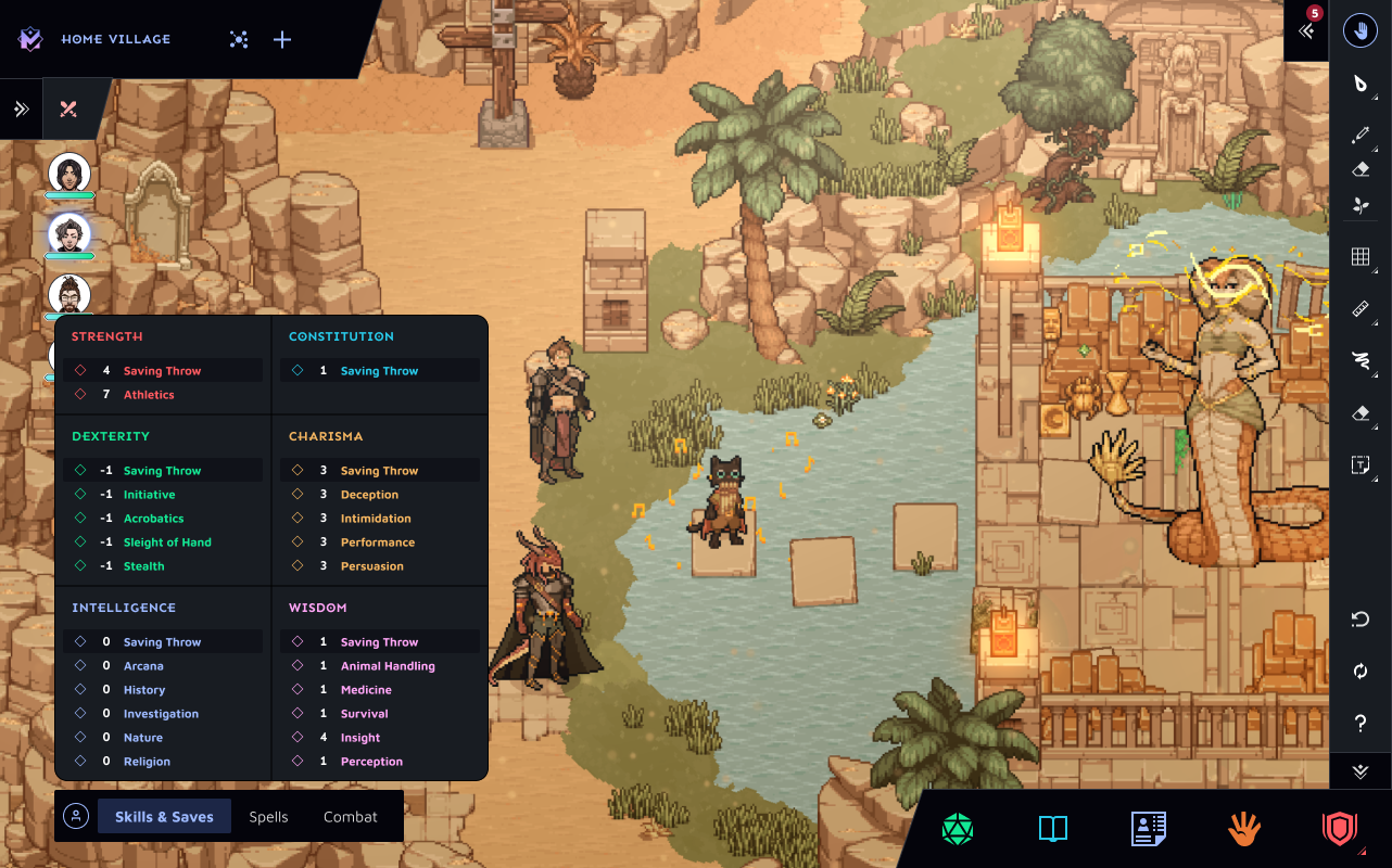
Wireframes & Development
The implementation of the redesigned HUD for One More Multiverse (OMM) was a meticulously coordinated effort, leveraging the insights from our research and playtesting phases. The new HUD was incrementally rolled out, first to a select group of experienced users for beta testing and then to the wider user base. Throughout this process, we closely monitored user feedback and engagement metrics to ensure that the redesign was meeting our objectives.
Key metrics used to measure the efficacy of the new design included:
User Engagement: We tracked the average session length and observed a 35% increase, indicating that users were finding the platform easier to navigate and more engaging.
Community Tutorial Attendance: The need for staff-led tutorial events decreased by 52%, demonstrating that new users were able to get started with the platform more independently.
Feature Utilization: Post-implementation, there was a 40% increase in the use of creative tools and features, highlighting the improved discoverability and usability of the HUD.
The redesigned HUD not only made it easier for new users to onboard but also empowered seasoned players to fully exploit the creative potential of OMM's tools. It also gave us an important opportunity to edit and reduce the number of features that were simply not important to users.